Blog
New features, fixed bugs, and software news are shown here
A good concise list is provided in the official changelog, here the aim is to be more explicit and sometimes give some examples. Before the respective new gretl version is released, the examples will only work in snapshots that are recent enough, or with self-compiled bleeding-edge versions.
New in what will be gretl 2023c
(this is just a selection, not exhaustive)
gridplot command
This new native command makes it possible to arrange several subplots in a grid (rectangular) layout. As such it will pretty much replace the contributed function package multiplot. There are basically two ways of using it:
First, using some other plotting commands, redirect the output to a string buffer inside a strings array. Then execute the gridplot command on that array. Example:
open australia
strings temparr = array(2)
qqplot IAU --outbuf=temparr[1]
kdplot E --outbuf=temparr[2]
gridplot temparr --output=display
Secondly, use the companion command gpbuild in a block format, and then define the individual parts:
open data4-10
gpbuild MyPlots
    gnuplot ENROLL CATHOL
    gnuplot ENROLL INCOME
    gnuplot ENROLL COLLEGE
end gpbuild
gridplot MyPlots --output=display
tsplots (virtual) command
You can now use the new tsplots command to create several joint time-series plots easily. Example:
open denmark
tsplots LRM LRY --output=display
This has actually "always" been possible with the scatters command --and was duly documented-- but it was somewhat counterintuitive to use a command for scatter plots to draw time-series lines.
plot multiple bands
Plotting a single band to represent a confidence area or something similar has been possible for a long long time. Now you can also insert more than one band into a plot. The syntax relies on specifying a hansl bundle for each band and then passing all of them inside an array of bundles to the gnuplot call. Meaningless example:
# create artificial data
nulldata 50
setobs 1 1 --time-series
series y = log(time)	# main line to be plotted
series w = normal()	# example width series
series x1 = y + 0.1 	# optional center different from y
series x2 = y - 0.1	# ditto

# specify the band specs
bundle b1 = _(center="x1", width="w", style="bars")
bundle b2 = _(center="x2", width="w", factor=0.2, style="fill", color="grey")
bundles bandspecs = defarray(b1,b2)

# execute the plot
gnuplot y --time-series --with-lines --output=display --bands=bandspecs
cluster-robust standard errors generalized for panel models
For the panel command, the --robust option has always given you robust standard errors in the sense that clustering by panel units (groups, whatever you want to call them) is done by gretl. Several generalizations are now possible with the --cluster option; see also ch. 22 of the user guide.
- clustering by period, example:
open abdata
panel WAGE const INDOUTPT --cluster=period
- clustering by a user-defined variable, example:
open abdata
panel WAGE const INDOUTPT --cluster=IND
- two-way clustering, example:
open abdata
genr time  # can also use: series mytime = $obsminor
panel WAGE const INDOUTPT --cluster=time,IND
Please also check out the --no-df-corr option if you want to compare results with other software.
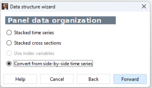
panel data handling: convert side-by-side time series in the GUI
This is not so easy to explain, but suppose you have a variable 'GDP' as several time series for several countries, say for France and the US. Then you want to convert this from a time-series dataset to a panel dataset with a single series spanning the two units (countries). This has always been possible with scripting, see section 4.5 of the user guide. Now you can also do it in the menu GUI interface.
